
Free Flexbox & Grid Generator – Create Responsive CSS Layouts
Designing layouts using CSS Flexbox or Grid can be confusing, especially for beginners. This tool simplifies the process by providing a visual interface where you can experiment with layout properties and instantly see how elements behave. Once you're satisfied, you can copy the generated CSS code and use it directly in your project.
- Live Flexbox & Grid Preview
- Easy Layout Customization
- Switch Between Flexbox & Grid
- Real-Time CSS Code Generation
- Beginner-Friendly Interface

Why Use This Flexbox & Grid Generator?
Build Responsive CSS Layouts Easily
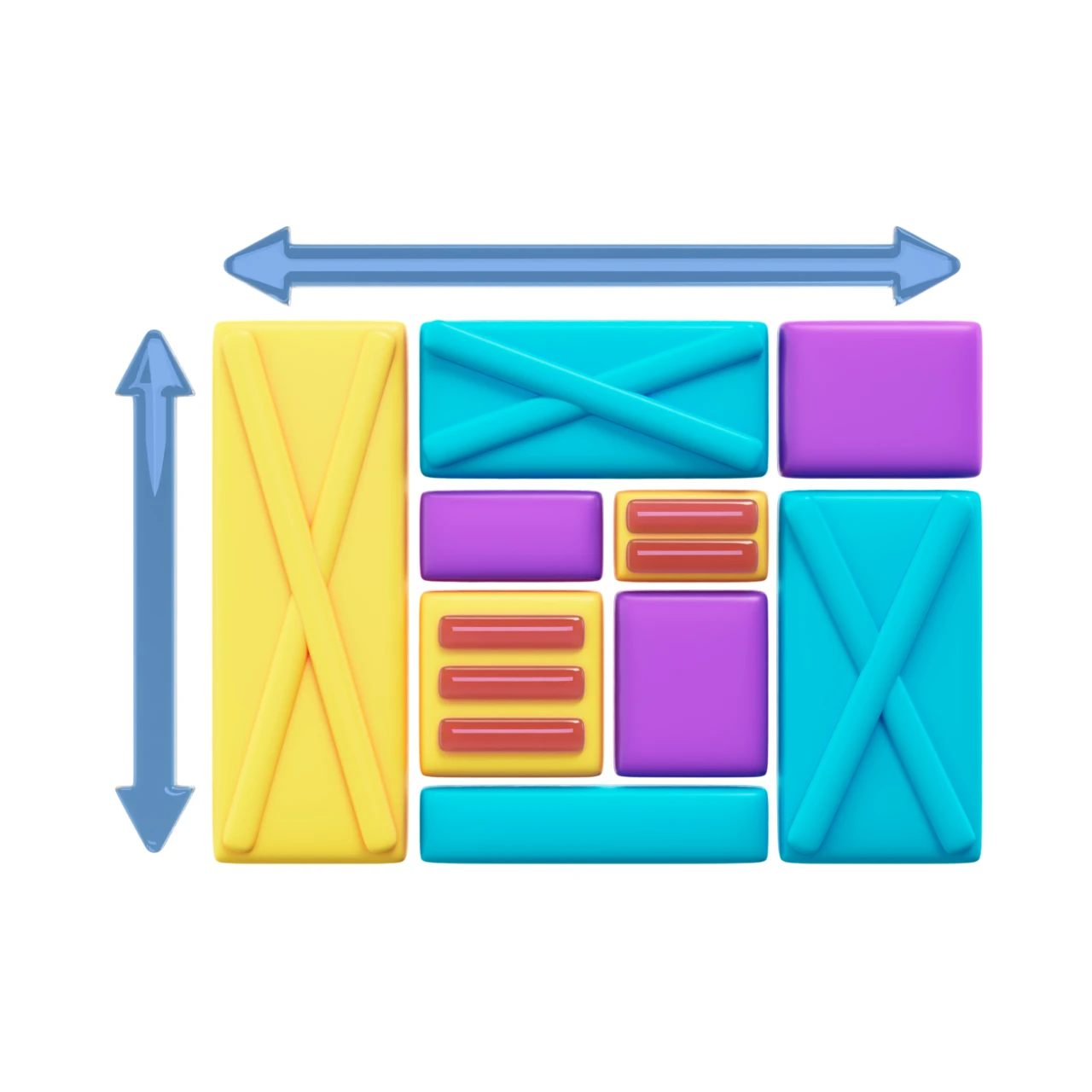
Flexbox Layout Builder
Create flexible one-dimensional layouts by adjusting direction, alignment, and spacing. Perfect for building responsive rows and columns with ease.
Live Preview & Customization
Experiment with layout settings and instantly see how elements behave. Modify justify content, align items, gap, and more with real-time visual feedback.
CSS Code Generator & Export
Generate clean and optimized CSS code for both Flexbox and Grid layouts. Copy and use it directly in your projects without writing code manually.
Smart Features That Make Flexbox & Grid Generator Stand Out
What Can I Do With This Generator?
Is This Flexbox & Grid Generator Free To Use?
Is The Generated CSS Code Optimized?
Can I Use This Tool For Responsive Design?
Who Is This Tool Best Suited For?
Everything You Need to Build Modern Layouts
Live SVG Editing & Preview
Adjust layout settings like flex direction, alignment, spacing, and instantly see the changes in real time. The live preview helps you understand exactly how your layout behaves across different configurations.
Clean & Optimized CSS Output
Generate clean, production-ready CSS code with a single click. The code is optimized for performance and follows modern best practices.
Simple & Developer-Friendly
Our tool is designed for ease of use. No complicated setup or coding required — just select options, customize your layout, and generate CSS instantly.
Works Across All Devices & Projects
This tool works smoothly on desktop, tablet, and mobile devices. Whether you're building websites, landing pages, dashboards, or applications, it fits perfectly into your workflow.